Getting started
First, generate an API key in the Mintlify dashboard.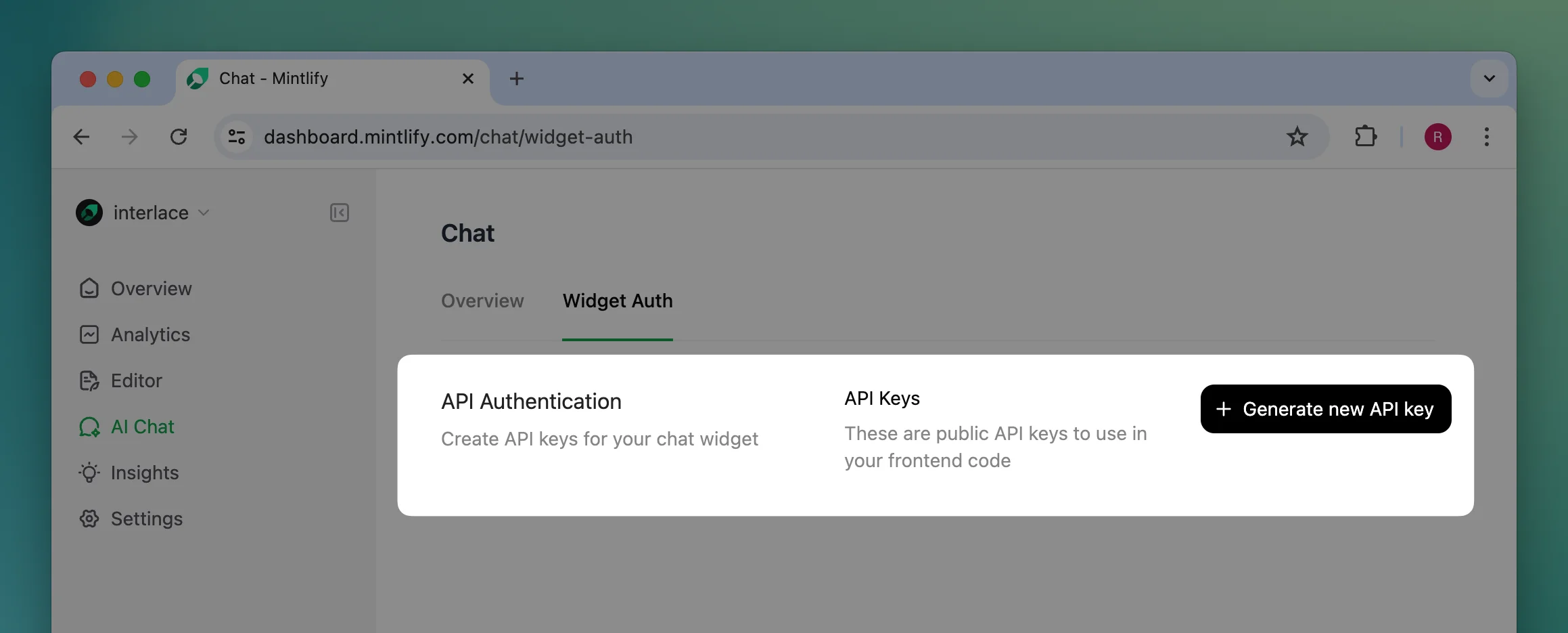
Installation
Add the widget by adding these script tags into your site’s<head>...<head/> tag.
@mintlify/widget-react package. Here is a basic example of how to use the component in your React application:
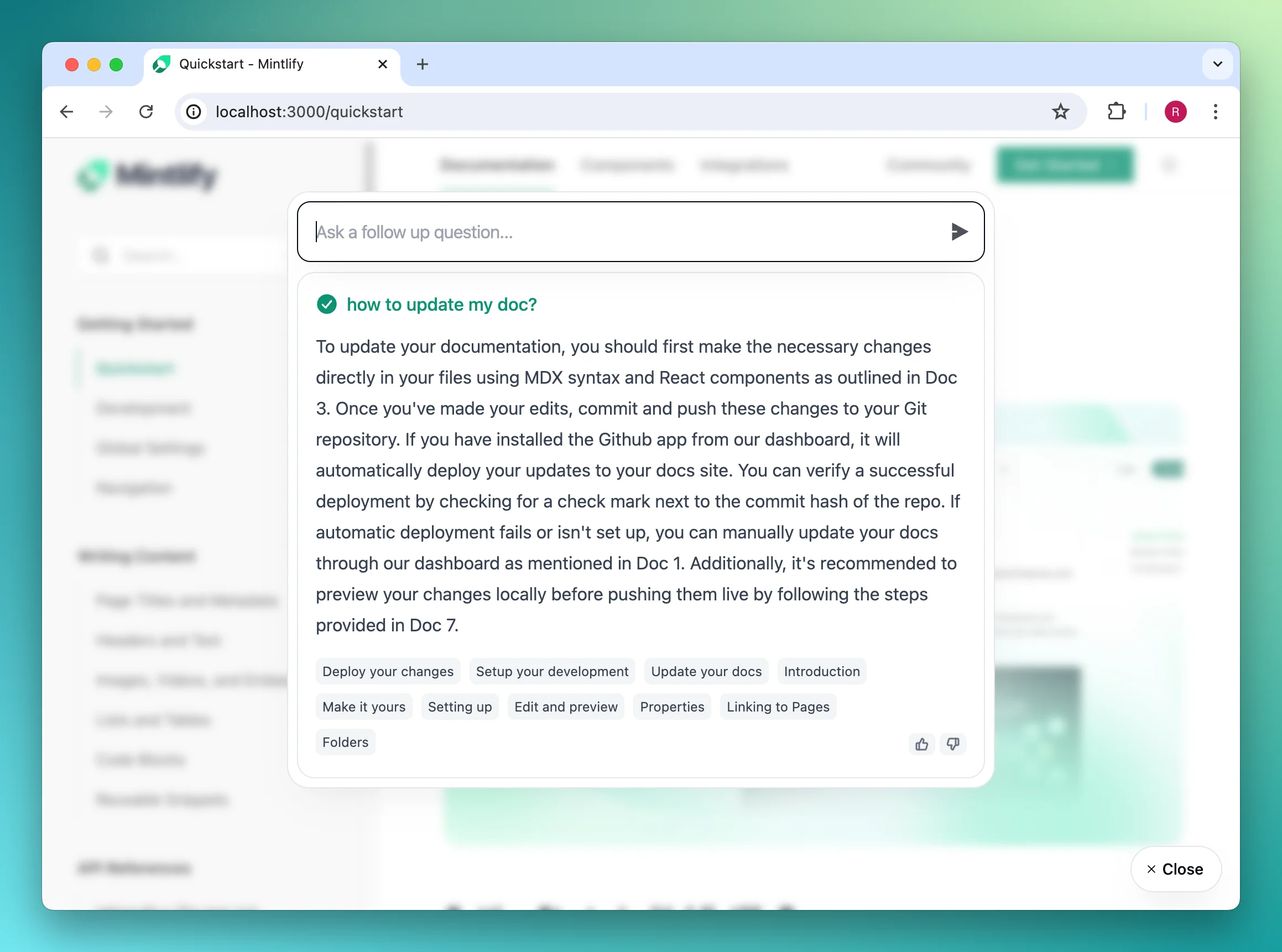
Usage
In the first script tag or the React component props, you can customize the appearance and other settings of the widget.mintlifyWidgetSettings accepts the following props:
| Prop | Type | Description |
|---|---|---|
connection | MintlifyWidgetConnectionProps | Information needed to connect to our API. Required. |
display? | MintlifyWidgetDisplayProps | Configurations for the widget appearance and interactions. |
tracking? | MintlifyWidgetTrackingFunctions | Callback functions for tracking analytics. |
MintlifyWidgetConnectionProps
| Prop | Type | Description |
|---|---|---|
apiKey | string | Widget API key generated from Mintlify dashboard. Required. |
url? | string | Used for internal testing only |
MintlifyWidgetDisplayProps
| Prop | Type | Description |
|---|---|---|
trigger? | MintlifyWidgetDisplayTriggerProps | Appearance of the trigger. |
colors? | MintlifyWidgetDisplayColorsProps | Colors used across the widget. |
chat? | MintlifyWidgetDisplayChatProps | Configs specific to AI chat. |
isDarkMode? | boolean | Controlled dark mode appearance. Defaults to OS preference. |
MintlifyWidgetDisplayTriggerProps
| Prop | Type | Description |
|---|---|---|
type? | 'button'|'input' | Type of the trigger to display. Defaults to button. |
label? | string | Label displayed in the trigger. Defaults to Get help for the button trigger and Ask anything... for the input trigger. |
buttonIcon? | 'chat'|'sparkles'|'mintlify' | Icon used in the trigger. Only available for the button trigger. Defaults to chat. |
iconOnly? | boolean | Only show icon in the trigger or not. Defaults to false. |
type='input' | |
|---|---|
 |
type='button' | 'chat' | 'sparkles' | 'mintlify' |
|---|---|---|---|
iconOnly=false |  | 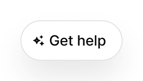 | 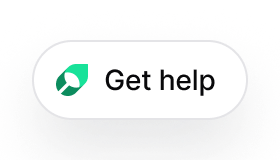 |
iconOnly=true |  | 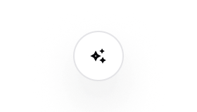 | 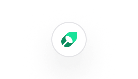 |
MintlifyWidgetDisplayColorsProps
| Prop | Type | Description |
|---|---|---|
primary? | string | Primary color used in the widget. Defaults to #0D9373. |
primaryLight? | string | Primary color in dark mode. Defaults to #55D799. |
MintlifyWidgetDisplayChatProps
| Prop | Type | Description |
|---|---|---|
openCitationInSameTab? | boolean | Open the citation url in the same tab or not. Defaults to false. |
exampleQueries? | string[] | Example queries to prompt the user to ask. Defaults to []. |
MintlifyWidgetTrackingFunctions
| Prop | Type | Description |
|---|---|---|
trackChatEnter | ()=> void | Triggered when the user opens the chat widget. |
trackCitationClick | (title: string, url: string)=> void | Triggered when the user clicks on a citation. |
trackChatThumbsUp | (query: string, response: string)=> void | Triggered when the user thumbs up on a response. |
trackChatThumbsDown | (query: string, response: string)=> void | Triggered when the user thumbs down on a response. |
trackChatFollowup | (query: string)=> void | Triggered when the user asks a question. |
trackChatClose | (queriesCount: number)=> void | Triggered when the user exits the chat widget. |